
This is part six of a beginner-level series about Unity, aimed at existing .NET business developers, who are interested in dipping a toe into something different.
In Part 1 - Getting started, we explore how a business developer could make a start using Unity, look at the Editor and overview some of the common words that you’ll encounter.
In Part 2 - Scripting, we learn about some coding concepts that are applicable to Unity.
In Part 3 - A prototype mobile app, we work through the steps needed to make a super-simple application and deploy it to a mobile device.
In Part 4 -Logging and debugging with Android , we look at how we can attach the debugger and use logging - basic tools for any developer.
In Part 5 - Unity UI 101 , we take a first look at Unity UI and interact with a basic button control.
In Part 6 - Unity UI Scrolling List - Creating the Scene , we take on a slightly more complex project, by creating a scrolling list of items using Unity UI.
In Part 7 - Unity UI Scrolling List - Adding the Code , we finish the project started in Part 6, by writing a script to call a REST service and populate items in our UI.
Overview
As a business developer, it’s likely that a common aspect of our work will include tasks such as retrieving a list of data from a RESTful API and then displaying this in a UI of some description.
In these final two articles of the series, we’re going to build upon the concepts that we started learning about in the previous article, Part 5 - Unity UI 101, and explore how we might reproduce this common development scenario, using Unity UI.
As a reminder, this series is not intended to be an in-depth beginner guide to Unity. Instead, this is meant to be a birds-eye overview, orientated towards existing business developers. You’ll probably be the sort of person who already has a good feel for how software is created, but just wants an overview of the main features and semantics of how a Unity project hangs-together.
- In this particular article, Part 6 - Unity UI Scrolling List - Creating the Scene , we’ll be focussing almost entirely upon using the Unity Editor to assemble the various UI elements that are needed.
- In the next and final article, Part 7 - Unity UI Scrolling List - Adding the Code, we’ll be focusing mainly on the script needed to perform a RESTful API call and then populate our UI.
What are we going to make?
We are going to:
- Use Unity UI to create a vertically-arranged list of “list items”
- The list will have a scrollbar to let us navigate up and down the list.
- Each “list item” will be Prefab that comprises a UI button alongside a UI readonly label that will be used to display some text.
- The project will make an asynchronous web request to an API endpoint for a JSON payload.
- The project will create a “list item” for each row of data - the message on the button and the label will be driven by the data.
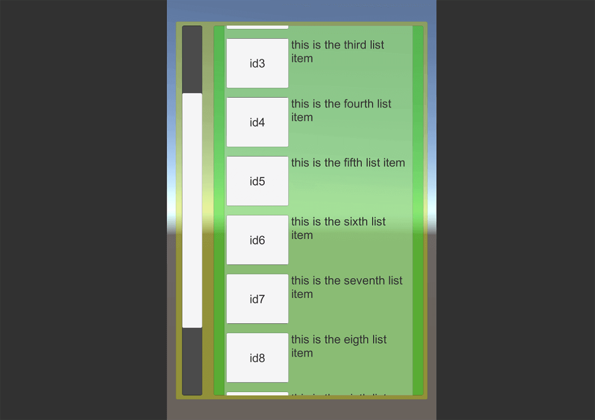
We’re absolutely not setting out to produce an amazing-looking UI - just the bare bones of what we need. We can expect the final result to look like this:
Create a new Unity project
We need to start with a fresh Unity App:
- Go ahead and create a new Unity Project. It doesn’t need to be configured for mobile deployment unless you want to - the default desktop version is fine for what we are doing.
- Starting in the Hierarchy View, create a new “Canvas” UI element (right-click, select “UI” → “Canvas”
- Just as we did in part 5 of this series, modify the “Canvas Scaler” Component of this new “Canvas” GameObject
- Set the “UI Scale Mode” to “Scale with Screen Size”
- Set the “Reference Resolution” of X and Y to “640” and “960” respectively, to suit the typical ratio of a mobile screen.
Create a Prefab that will represent an item in the list
Earlier, we identified that our project is going to display many rows of something that we will call a “list item”. As a reminder, we established that a “list item” will comprise of two UI elements - button and a readonly label
If we come from a background of using HTML, it may help us to think of this “list item” as being a
<div>with nested<button>and<label>elements.
As with many other UI frameworks, we’ll create this “list item” as a template, from which we will create multiple instances.
In the semantics of Unity, a GameObject template is called a Prefab.
We’ll start our project by creating a Prefab that represents a “list item”. In the Hierarchy View:
- As a child of the “Canvas”, create a new empty GameObject and rename it to “ListItem”
- Modify the “Transform” Component of “ListItem”, so that :
- “Width” is “450”
- “Height” is “140”
- Modify the “Transform” Component of “ListItem”, so that :
- As a child of the “ListItem”, create a new Button UI element and rename it to “ListItemButton”
- Modify the “Transform” Component of “ListItemButton”, so that :
- “Anchor Preset” is “Top Left”
- “Width” is “150”
- “Height” is “120”
- “Pos X” is “80”
- “Pos Y” is “-70”
- Modify the “Text” Component of “ListItemButton/Text”, so that : *“Font Size” property is “28”
- Modify the “Transform” Component of “ListItemButton”, so that :
- As a child of the “ListItem” (and sibling to “ListItemButton”), create a new Text UI element and rename it to “ListItemText”
- Modify the “Transform” Component of “ListItemText”, so that :
- “Anchor Preset” is “Top Left”
- “Width” is “280”
- “Height” is “120”
- “Pos X” is “300”
- “Pos Y” is “-70”
- Modify the “Text” Component of “ListItemText”, so that : *“Font Size” property is “28”
- Modify the “Transform” Component of “ListItemText”, so that :
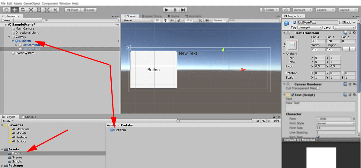
- In the Project View, create a new folder and rename it to “Prefabs”
- From the Hierarchy View, drag the GameObject “ListItem” and drop it into the new “Prefab” folder.
- Notice how “ListItem” now becomes coloured blue.
- Finally, in the Hierarchy View we can delete the GameObject “ListItem”. To clarify, this will now only be removing the instance - the object will continue as a Prefab stored in the “Prefabs” folder.
If we later wanted to edit the Prefab, we could double-click it in the Project View.
Note that the screenshot below was captured just before the final step above, so it is showing both the Prefab version and an instance in the Hierarchy. I wanted to show how items, that are instanced from a Prefab, turn blue in the hierarchy.
Create UI element that will represent the main containing panel
Next, we want to create a selection of GameObjects that will become the scrolling panel that will contain multiple “list items”
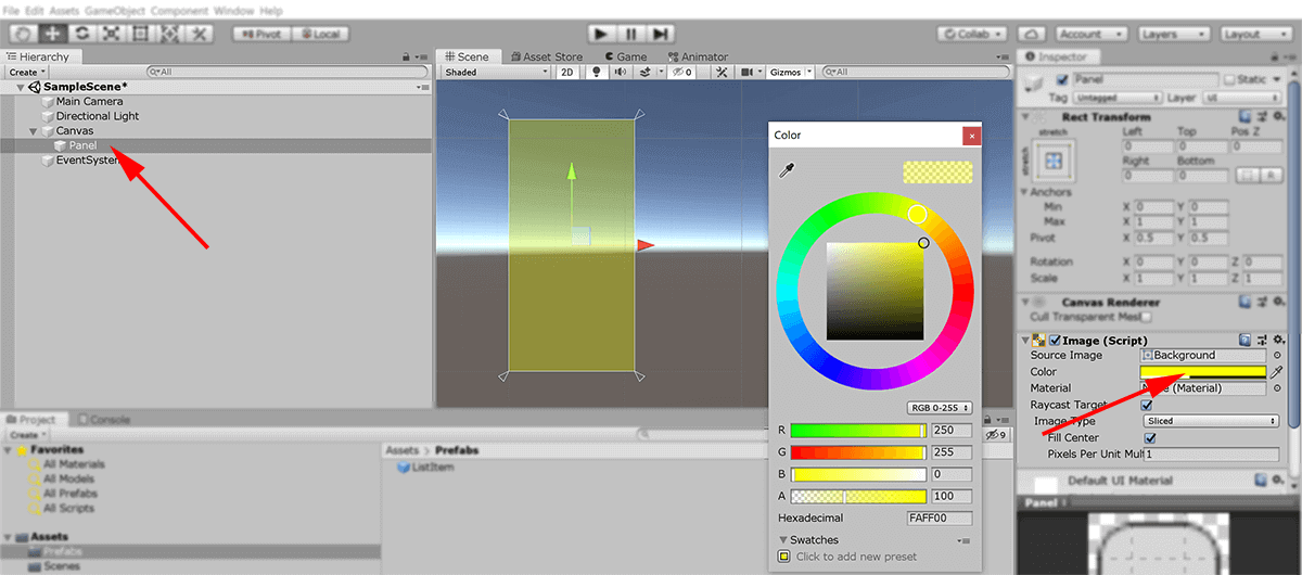
- In the Hierarchy View, start by creating a new “Panel” UI Component as a child of “Canvas” (right-click “canvas”, select “UI” → “Panel”).
- Rename the “Panel” to be “ListContainer”
- To help us better visualise the new “ListContainer”, highlight it in the Hierarchy View and locate the Component “Image”.
- Find the attribute “Color” and select something other than white to make it more obvious to differentiate - I chose a yellow colour for use in the screenshots.
Slightly confusingly, when we create a “Panel” UI Element, it doesn’t actually have a corresponding Component called “Panel” - instead a more generic “Image” Component is used to define how it should look.
Notice that by default the “ListContainer” fills the dimensions of its parent GameObject “Canvas”. Let’s make this panel a little smaller so it doesn’t fill the entire screen:
- Select the “ListContainer” GameObject and edit its “Transform” Component like this:
- Change the “Anchor Preset” from “Stretch” to “Center Middle”
- Change the “Width” to “600”
- Change the “Height” to “900”
Create a UI element that will represent the viewport
If we were to create a list of “list items” and add them to the “ListContainer” right now, we would find that those items would overspill the edge of the rectangle.
Instead, we want to create a clipping-mask that keeps the “list items” contained within the panel, as we might expect them to be
This mechanism also drives the scroll-bar, that we’ll be adding afterwards.
- In the Hierarchy View, highlight the “ListContainer” GameObject
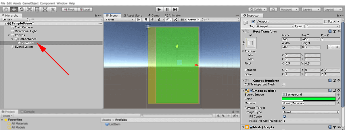
- As a child of “ListContainer”, create a second new “Panel” and rename it to “ViewPort”.
- Still in the Hierarchy View, click the newly created “ViewPort” to highlight it.
- Looking at the Inspector View, click the “Add Component” button.
- In the search bar, type the word “Mask” - and then select the “Mask” component from the now-filtered list of components.
We now want to resize the “ViewPort” so that it is slightly smaller than the “ListContainer”:
If we haven’t already, select the “ViewPort” GameObject in the Hierarchy View
Change the colour of the “ViewPort” so we can distinguish it more easily.
- In the “Image” Component, set the “Colour” to a shade of Green (using the colour picker)
Edit the “Transform” Component attributes like this:
- Change the “Anchor Preset” from “Strech” to “Center Middle”
- Change the “Width” to “500”
- Change the “Height” to “880”
- Change the “Pos X” to “340”
- Change the “Pos Y” to “-450”
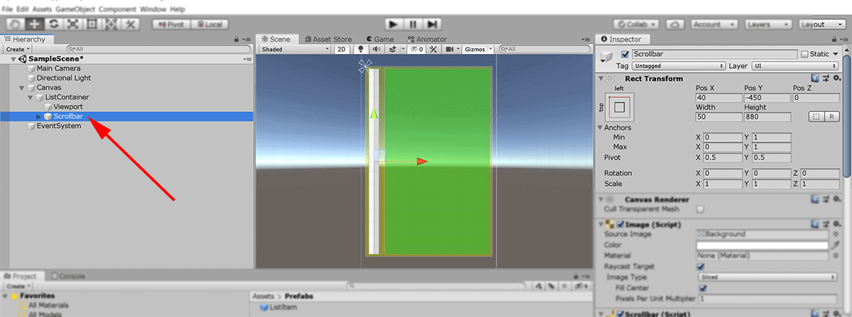
Create a UI scroll bar
Now that we have a Viewport in position, let’s add the ScrollBar element that will work in collaboration with it!
- In the Hierarchy View, highlight the “ListContainer” GameObject
- As a child of “ListContainer” (and a sibling of “ViewPort”), create a new UI element of type “Scrollbar”. We don’t need to rename it.
- Edit the “Scrollbar” Component attributes of “Scrollbar” like this:
- Change the “Direction” to “Bottom to Top”
- Edit the “Transform” Component attributes of “Scrollbar” like this:
- Change the “Anchor Preset” to “Top Left”
- Change the “Width” to “50”
- Change the “Height” to “880”
- Change the “Pos X” to “40”
- Change the “Pos Y” to “-450”
- Edit the “Image” Component attributes of “Scrollbar” like this:
- Set the “Color” to a dark-grey shade.
We set the background colour of the scrollbar to darker shade so that we can see it more easily - otherwise, both the handle and the slidebar are the same shade and makes it difficult to see.
Create a Layout Container
We’re getting closer to the part of this process that displays a vertical list of “list items”. First, we need to create yet another GameObject that will serve as a container for the list.
- In the Hierarchy View, highlight the “Viewport” GameObject
- As a child of “Viewport”, create a new “Panel” UI element. Rename it from “Panel” to “LayoutContainer”
- In the Hierarchy View, make sure that this new “LayoutContainer” is selected and look across to the Inspector View
- Using the “New Component” button, enter the text “vert” as a filter and select the Component “Vertical Layout Group” from the list.
- We can leave all of the values as their default.
- Using the “New Component” button a second time, enter the text “cont” as a filter and select the Component “Content Size Fitter” from the list.
- Change both the “Horizontal Fit” and “Vertical Fit” to be “Min Size”
We need to pause to explain a few things.
The “Vertical Layout Group” Component is responsible for automatically ordering items in a vertical stack layout.
There are other Components related to “Vertical Layout Group” that do similar jobs: These include “Horizontal Layout Group” and “Grid Layout Group”
Note that Unity : Some of the best optimization tips for Unity UI recommends not using Layout Groups because of the way they impact performance. However, they are an appropriate tool for our purposes.
The Component “Content Size Fitter” is used to dynamically resizing the container. By specifying the “Horizontal/Vertical Fit” settings to be “Min Size”, we are saying that “we want the container to be just big enough to fit around the vertical stack of list items”.
Initially, this does mean that the “LayoutContainer” GameObject will appear to vanish in the Scene View … this is simply because it has “resized around nothing”. Later, we will use a script to add items to this container - in which case it will resize itself automatically.
Again, this is another mechanism that is used to drive the scrolling bar functionality.

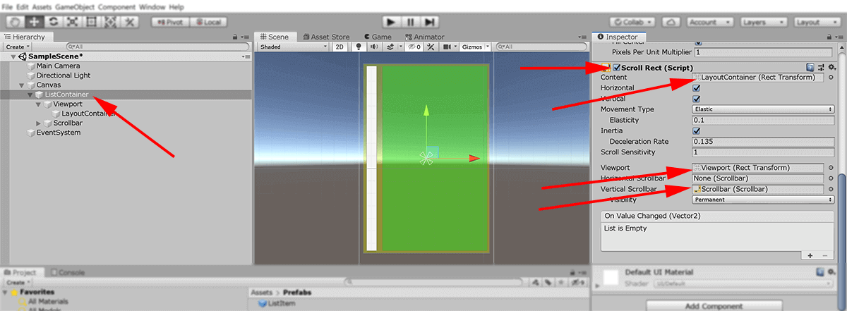
Add ScrollRect component to associate everything together
We have all the elements that we need in place, we just need to add a Component that brings them all together.
- In the Hierarchy View, highlight the “ListContainer” GameObject and look across to the Inspector View
- Using the “New Component” button, enter the text “scro” as a filter and select the Component “Scroll Rect”
- Within the Component “ScrollRect”, modify the fields as follows:
- Locate the field “Content”; drag and drop the GameObject “LayoutContainer” from the Hierarchy View and into the box.
- Locate the field “Viewport”; drag and drop the GameObject “Viewport” from the Hierarchy View and into the box.
- Locate the field “Vertical Scrollbar”; drag and drop the GameObject “Scrollbar” from the Hierarchy View and into the box.
- Change “Horizontal” checkbox to be unchecked (so as to prevent side-to-side movement)
- Change “Movement Type” from “Elastic” to “Clamped” (makes the motion more linear and removes the “springy” effect)
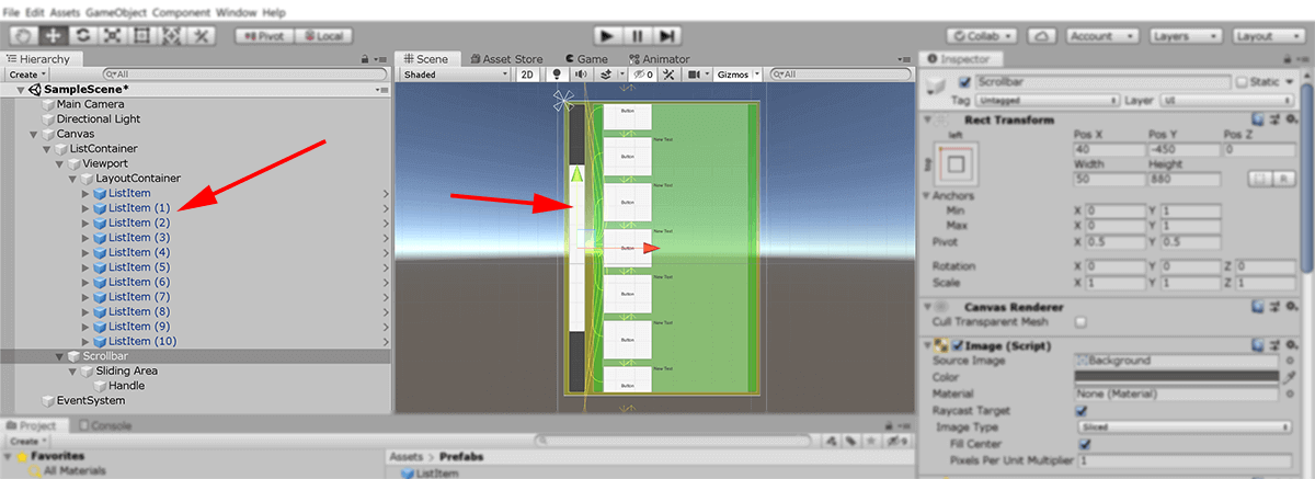
Technically speaking, at this point we’re all set to go. However, because we don’t have any “list items” to test against, we won’t be able to demonstrate it.
So as a temporary step, we’ll manually add in a number of items to simulate how it should work:
- Drag the “ListItem” Prefab from the Project View and drop it onto the “LayoutContainer” GameObject in the HIerarchy View
- Repeat this process at least seven times (so as to have more “listitems” than there is available space in the Viewport.
- Press the “Run Game” button to test things out.
- Check that the scrollbar works as expected!
If we’re satisfied that the scrollbar is working as it should, we can go ahead and …
- Remove all of the instances of “ListItem” that we just added as children of “LayoutContainer” GameObject (i.e. return it back to how it was previously)
- Don’t delete the Prefab of “ListItem” that is stored in the “Prefabs” folder in the Project View!
In the next and final part of this series, we’ll continue our work started in this article to create a more advanced interface using Unity UI.